

Design Blitz
As I continue with the second week of my PR Publications course, I am starting to gain a deeper understanding of various design concepts. Our instructor gave us the chance to apply this understanding by finding examples of these designs, taking pictures and identifying which concept they represent.
MINIMALISM & USE OF SPACE
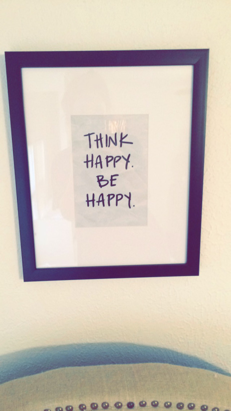
I love the simplicity of this picture. The solid white background paired with with the black frame draws the eye immediately to the words. They are powerful enough on their own, so the clean white border allows them to be the center of attention. I think in this picture, the saying, “less is more” rings true!
TYPOGRAPHY

I think this parking sign is a good representation of the importance of the design concept, typography. The red, bold font immediately gives you the impression that the message on the sign is a warning. In this case, “NO PARKING” is in larger font than the words below it because for the most part, that is the rule. The words below are smaller because they only apply to the exception, which is a rare occasion.
SYMBOLISM

What greater symbol than the American flag? When using the design concept, symbolism, no words are needed because the design is a symbol in itself, which is represented in this picture.
COLOR

This picture represents the use of color as a way of drawing the eye in. The frame and background is solid white so that our attention is fixated on the flowers.
FORM, FUNCTION & MESSAGE

I thought this gate served as good representation of the use of form, function and message within a design. The gate is constructed to serve the function of opening and closing the entrance to private property. The closed gate sends the message that access to the property has not been permitted.


Comments