

Design Blitz
For the “Design Blitz” Lesson 1.2, we covered the basic design principles of PR publications. Learning about different design elements was interesting because I never noticed why our everyday items look the way they do. The first thing I usually notice while looking at something is it if it pleasing to the eye before functionality.
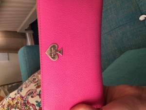
For my first item, I am covering the minimalism & use of space design element. I feel like wallets are the perfect example of this. The pink wallet acts as white-space and the design logo on the front clearly states what brand it is.
My second item is my planner, showing balance. I use my planner to keep my life organized and the design of my planner is perfectly symmetrical making it easy to look at and easy to find what my weekly schedule will look like.

The third image is of my “The North Face” backpack. This shows metaphors/ symbols. The company logo is known nation-wide and whenever you see the logo you think of outdoor, active items. The logo visually represents the explorers interests because the three lines almost look like a sunset and the advertisements for The North Face are always people doing outdoor activities.

My water bottle is an example of form/function/message. It has the amount of water clearly stated which suggests drinking more water and I think when people use a water bottle with this clearly marked they are more than likely to drink more water.

My fifth photo is of my flash drive. I think this is a design element of proportion. The flash drive is so small yet holds so much information it is almost deceiving.


Comments