

Design Blitz
After I began looking for items to write about in my assignment I found almost all these elements in basically everything around me.
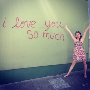
Typography: I went to Austin, Texas with my sister this weekend to look for wedding dresses and I thought “wow this will be a great place to look for signs and ads”. I’m sure from the picture a lot of you have seen or at least know about this wall in Austin. I stopped to take a picture with it before I realized this is a perfect example of typography. There is nothing on this wall except for pink, cursive writing against the pale green wall. This lettering isn’t fancy or overly dramatic. It kind of makes me think of handwriting for your average, everyday person.
Color: I was wondering my room looking for more examples when I stumbled upon this notepad on my roommate’s desk. The thing that attracted me about this notepad was all the different colors combining yet somehow standing on their own. It looks like after all the colors were combined the creator took water and splashed in on the pad to wash the colors out. I noticed that even though this pad of paper is rather colorful any color ink could stand out against them. Designs can be rather effective by catching someone’s eye or make them feel a certain emotion from just using certain colors. But it is important to remember as a designer not to go overboard.

Minimalism and Use of Space: I came across this coffee bus when I was exploring OKC with my mom. I found Junction Coffee’s design to be really intriguing. They easily could’ve have used the whole bus to create a design and advertise their name but instead used a thing band across one side of the bus. The design in the center is so simplistic and easy to look at, which really spoke to me. The bus isn’t screaming for attention by using any crazy colors or designs, it is catching attention for the very simple use of words and a plain design. Also, if you are every in OKC and come across this bus, you must stop for coffee. It is delicious!!

Symbols/Metaphors: So last year I had the opportunity to be apart of Sooner Scandals Executive Committee. When I was looking for more examples, I found this graphic we used to advertise our benefit night. The graphic used the hotdog and the pickle to clearly advertise the locations of the benefit night (the pickle for Pickleman’s and the hotdog for Diamond Dawgs). I thought this graphic did a great job of using the symbols to advertise something else. I do think the graphic is a little much and it does have some typos in it. But I do think it is a great example for symbols/metaphors in a design.


Comments