

Design Blitz
This week for my PR publications class we were asked to go out across campus and find different ads, signs and objects that described different elements of design. For me, this was a fun opportunity to search for things around campus that displayed certain design elements. The five design elements that I found were symbols, rhythm, color, typography and unity.
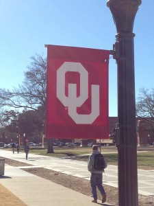
1. Symbols. Symbols are a representation of something else. For this first element, I chose the interlocking OU sign that most of us see around campus. This symbol is a familiar logo that stands for the University of Oklahoma. This design element is effective because whenever people see the interlocking OU they immediately think of the University of Oklahoma.
2. Rhythm. Rhythm is a strong, regular, repeated pattern of movement. For this second element, I chose the brick on a sidewalk to show the repeated movement. The brick sidewalk is an effective design element because it simply shows how rhythm can be anywhere. The use of rhythm for a brick sidewalk is aesthetically pleasing which makes the buildings nearby look much better. It is an easy element that adds a touch of sophistication to any design.

3. Color. Color is a design element that is used to highlight words and pictures to catch the eye. For this third element, I chose a sign that used three colors to effectively communicate a resume building on Hiresooner.com. The blue, orange and tan are simple, but they use color in a way that is aesthetically pleasing and not too overbearing. I really enjoyed this poster, because it effectively relays the information by using a simple color pallet.

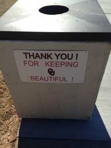
4. Typography. Typography is the style or appearance of printed matter. For this fourth element, I chose a sign that says, “THANK YOU! FOR KEEPING OU BEAUTIFUL!” I believe this sign is a good representation of typography because the “thank you” and “OU” are in different fonts then the rest of the sign. The entire sign is in all capital letters which means that it is important. The use of exclamation points signifies that it is an important message that should be taken seriously. This sign is seen everywhere on campus and it is very clearly written, so that everyone can understand the message. The design element is effective, because it is clear and it has a strength to it that suggests that this message is important.
5. Unity. Unity is when different elements are combined to be a whole. For this fifth element, I chose a mural in my room. This mural spells out SigEp, but it is in the shape of a buffalo. It is different letters that come together to create the silhouette of an animal. This design element is effective, because it highlights how words and images can be united to create great art.

I really enjoyed this assignment. It showed me to be on thepattern look out for effective uses of different design elements. I like the opportunity to go throughout campus and look for signs or images that displayed these elements. All in all, it was a great assignment and I really enjoyed hunting for the elements of design.

Comments