

Design Blitz
For my design blitz, I wen through a fashion magazine to find examples of design concepts. I figured a magazine is a good place to look for design concepts because it is so centered on visual communication and aesthetic.
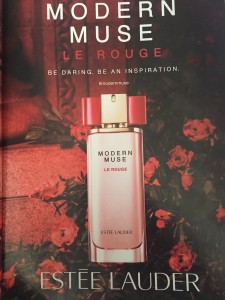
This Estee Lauder Rouge advertisement provides examples of both color and typography. The red tint to the whole image, as well as the use of roses, creates a feeling of red and a mood that mimics the products name. The typography was unique to me because it was centered, but also because the sort of tag line “modern muse” was larger than the product name which is “Le Rouge.” But it is a good example of putting the most important information in the largest font and then distinguishing bylines with smaller and different fonts.
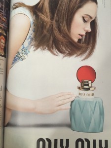
This Miu Miu ad reminded me of an example given in class of how the TV show Mad Men uses color and aesthetic to create a mood of a time period. The add does this with the colors of the bottle and the layout, but most importantly the style of the model’s hair, makeup, and clothing.
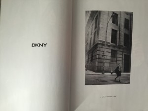
The DKNY ad is a great example of minimalism and use of space. The pages are in black and white and the photo doesn’t bleed off the page, which is unusual for a magazine ad. The use of space is also interesting because it’s a two page ad and all that is on the left page is the brand name DKNY, which makes it really pack a punch.

For the metaphor design principal I find this Louis Vuitton ad where the slogan for the campaign is “The Spirit of Travel.” The image evokes this spirit with the luggage and the dessert background.

Comments