

Design Blitz
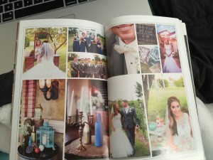
This first photo is from a bridal magazine. The layout of the photos show alignment. The photos are in line with one another and it is clear that a grid was used to create the spread.

This photo is from a bridal magazine as well. The way the different lines are spaced so it appears organized and easy to understand shows proximity. I think this ad was a great example of proximity because it is easier to take in all the information given in the way it is shown, rather than being all together.

This photo was taken at my internship at the Regional Food Bank of Oklahoma. This is a photo of one of the marketing tools being used in an upcoming event. The brochure uses contrasting colors to make the statistics and important information stand out to readers.


Comments