

“dEsIgN bLiTz”
For this particular assignment, I chose to mainly focus on advertisements to relate to a few of the terms we learned about in this unit. Please excuse my photography skills on some of the images. I am horrible at cropping/editing, hence one of the reasons why I need so much help with Photoshop and InDesign.
1.) DOMINANCE
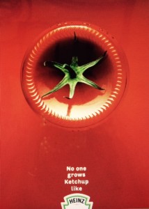
This ad seemed particularly dominating to me. It is clear by noticing the ketchup bottle that what they are trying to advertise is Heinz ketchup. I really enjoyed how the advertiser used the bottom of the ketchup bottle as the sole focus of the ad. There is no question as to what the product is.
(Photo retrieved from frederiksamuel.com)
2.) Metaphors/Symbols
This is a picture of a painting I have hanging in my bedroom. It is something that my sister made for me for my 19th birthday and just so happens to by the symbol for my sorority. To me, the fleur-de-lis symbolizes sisterhood and all the great memories I have made during my time in Kappa.

3.) Color
Interestingly enough, this picture is an advertisement for Tylenol. I’m not sure I get what they’re trying to advertise, but it definitely caught my eye.
 (Taken from: toptentop.com)
4.) typography
I really enjoy ads like this that structure the words around what is being advertised. For me, it keeps me interested in the product and I find myself glancing back to it over and over again.
 (Photo from: 24point0.com)
5.) Minimalism/ use of space
I like what the advertiser did her by solely using the space for the product. The rest is left for “white space”, but makes it easy to focus on the one object.
 (Photo retrieved from: funkydowntown.com)


Comments