

Design Blitz
The University of Oklahoma
Design concepts are everywhere if you just take a look around. For this assignment, I walked around OU’s beautiful campus to find five design elements of my choice. As a student recruiter for OU, I’d like to think I know all the design element hot spots (only time will tell if I really do). I began by looking at the seven different design elements and went to what object, ad or sign came to me right off the bat.
COLOR
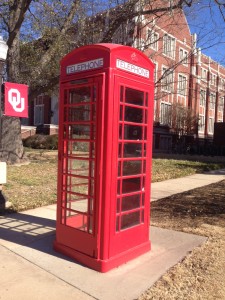
If you look around campus, the buildings and architecture are all similarly designed and to an outsider, look just the same: red bricks and brown leather couches inside. On campus tours, I always have students and parents wonder about the red telephone booths. President Boren studied at Oxford University and really liked the way they looked, so he brought 14 of them back. These phone booths are all around campus and continue to catch every student’s eye. The red is a huge pop of color and even represent the Crimson & Cream. The phone booths are an effective color element on campus because they stand out against the Cherokee Gothic architecture and the dark red brick buildings.

TYPOGRAPHY
Typography tells a story. The Bizzell Memorial Library, “The Bizz”, was built in 1929 and has unique Cherokee Gothic architecture. Carved into the architecture is the word “library”, directly under a statue of William Bizzell, OU’s 5th president. The typography is important to The Bizz because it shows the age of the building and the time period it was built.
USE OF SPACE 
Professor Croom discusses how simplicity and the use of space are extremely important to typography and design work. It’s okay to have white space and to purposefully draw the eye to the object or word drastically against the white space. As I walked around campus, I tried to focus on areas or buildings that had unique space. Walking down the south oval, I am reminded to recycle and thanked for keeping OU beautiful everyday. On almost every campus trashcan, there is a sign encouraging students to recycle and giving them a place to do so. The latest sustainability effort is “Crimson and Green” and is an online commitment for students and faculty to keeping OU beautiful by recycling. Pictured on the right, the play on words has a great use of space. Although Professor Croom advises to only use two different fonts on a small space, I think the typography chosen directly correlates with the message. It’s clean and easy to read. “CRIMSON & green” are spaced closer together than “RECYCLE HERE”. The spacing used tells the reader there are two different messages on one sign. The fonts are clear and the message is straight to the point. The typography is very appealing to the eye and is easy to read while walking by.
PROPORTION 
Evans Hall is one of the most photographed buildings on campus. It is home to President Boren’s office and the office of the Provost. Evans Hall burned down in both 1903 and 1907, resulting in the last renovation which was built in 1912. Evans Hall has strong proportion because it is identical on both sides. As I took a panoramic picture of Evans Hall, I realized that the building had the same architecture on both sides. If you were to split the building down the middle, each side would be identical. The architecture and shape of the building is very appealing to the eye and covers a large amount of space on the North Oval. Overall, Evans Hall has great proportion.
SYMBOLISM
The Seed Sower is arguably the second most known symbol for Sooners behind the OU logo. The Seed Sower is a statue on all three of OU’s campuses in Norman, Tulsa and Oklahoma City. It represents knowledge, opportunity, history and tradition. It is at the front of the University of Oklahoma and is often the first thing people see on this campus.
The University of Oklahoma is one of the most well designed campuses through out all aspects. OU represents color, typography, use of space, proportion and symbolism.


Comments