

Design in the Real World
As I said in my last post, I have been learning about design and typography the past week in my PR publications class. Another activity we were asked to complete was a “design blitz” where we looked for elements of design, such as color, typography, and minimalism, in real world design. We were asked to share pictures of our findings.
Color
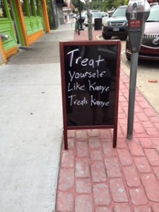
I saw this sign on Campus Corner outside the new chocolate shop, and snapped a picture because I thought it was hilarious. But in a design context, this works because of the contrast between the black background and the white print, which allows the message to be easily read.
Typography
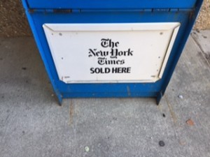 On the way to class, I came across this newspaper box outside the Physical Science Center. The font used for the New York Times gives an idea of what the newspaper stands for. The font, which looks old gives the newspaper the quality of being well-established (which I’m sure no one would argue about). The script also looks more intricate and most people would likely agree that the New York Times tends to have a more dense subject matter than many other newspapers.
Symbol
The Coca-Cola bottle is recognized worldwide and is synonymous with all things American. 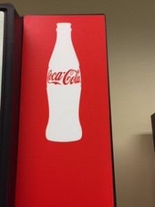
Even though the majority of Coca-Cola consumed does not likely come in the original bottle pictured, people still recognize it and associate with the classic Coke brand. Even to me, the Coke bottle has a deeper meaning. I always associate the Coke bottle with celebrating the 4th of July and fireworks.
Function and Message
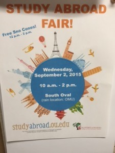 I found this flier on the bulletin board in the College of Education, where I work. I liked how the maker of the flier was able to grab the attention of the audience with the bright colors and the big graphic in the middle. The picture of the world also conveys the meaning of the flier–to announce the study abroad fair.
Minimalism
I saw this flier in Kauffman Hall on one of the bulletin boards.  I thought it was interesting how the designer used the large M in the center of the page and then listed the information (which all happened to begin with an M) on top of the M. It was an attention grabber. The designer also used muted colors, which gives the flier a minimalist look.
I enjoyed this activity because I was able to apply what I am learning in class to the real world and it allowed me to look at things that I see every day from a design perspective.


Comments