

Design Project Reflection
This week in PR Pubs we completed our first design project. Throughout the past couple of weeks I have been designing a business card and letterhead for a St. Louis-based Pilates studio, Pilates of West County. With a lot of research, designing, feedback and more designing both the business card and letterhead have drastically transformed from the first draft to the final.
Because I have close ties to Pilates of West County, I was excited to work on this project from the beginning and looked forward to creating something that I could show the owner and that she could possibly use.
After my first draft I thought that I had created something that was presentable, but I knew that it could be improved. The first draft didn’t include a logo because I had trouble with it in Photoshop, so I decided to use a series of dots because I thought they looked good. Looking back, that first design is far from what I think represents Pilates of West County and the design was not very strategic at all.
I’ve learned that just because you think something looks good does not mean it’s right for the client and the business. I’ve also learned that anyone can have good taste in design, but actually designing something that is strategic, effective and aesthetically appealing takes a lot of practice. I’m much happier with my final copy of the business card and letterhead that I created for Pilates of West County, but I know that if I continue to practice design and come back to these publications in a few weeks or months I would probably have a different and even better approach toward them.
My reaction throughout this whole project was a continuous desire for improvement. I think I reacted in that way partially because I’m a novice designer and partially because seeking improvement is in my nature.
Each time I use InDesign I feel more confident with my abilities. I’m still learning how to use Photoshop, but I’m looking forward to our next project, in which we’ll heavily use Photoshop.
I don’t know that I would do anything differently if I were to start over. I sufficiently researched my client and its competitors as well as creative designs. I think for me it’s about practice and I know that each time I do something like this I’ll improve my design skills.
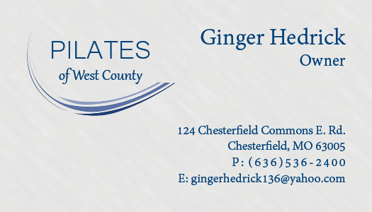
Below is the front of my final business card for Pilates of West County. The changes from draft one to this are a result of the feedback I received. The owner’s name and title are on the front rather than the back and the address, phone number and email are presented more strategically. I also figured out how to cut out part of the logo so that I could use it on this card.
Below is the back of the business card I created. Though my goal was simplicity, the first draft was more boring than anything. With this draft I feel that I captured simplicity instead. The quote represents everything that Pilates of West County stands for while also describing what Pilates is. It also includes the website, which is a very necessary piece of information for clients to be directed toward.

The letterhead I created for the business is below. It resembles the business card through the logo and font and includes all of the same necessary information in a similar format.

To future students I would say don’t get discouraged if you’re not producing what you’re picturing in your mind and ask for feedback and critique on your designs.


Comments