

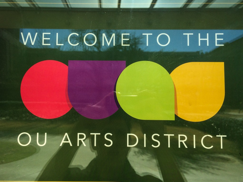
Design Scavenger Hunt
ONE
This welcome sign for the OU Arts Distract grabbed my attention with the vibrant use of colorful shapes — which also serve as a symbol for OUAD. A clean, legible typeface strongly contrasts with a neutral, dark background to create an overall polished, but playful feel.

TWO
With a hypnotizing 3-D effect, this informational poster for “Art in Focus” creates a striking image for walk-by viewers. The most imporatant information — the event’s date and time — are clearly color-popped in bright orange. Information is clearly grouped and displayed in a clean, sans-serif typeface.

THREE
With another trippy 3-D effect, this poster advertising a guest juror lecture appears both mysterious and aesthetically pleasing. The immersive, full-bleed image stokes viewer curiousity: “Exactly what does this bearded man do?” The relevant text below clearly contrasts with the image to effectively communicate the important bits.

FOUR
I love this display’s unique color and texture, complemented by effective repetition. The three word phrase parading across the bottom of the frame succintly sums up the image’s message. (And it’s just plain fun.)

FIVE
This piece of student work couples bold typography capturing the state’s feel with a color palette evocative of a geographic map. Symbols are used to add an unexpected twist — adding an element of morbid surprise.

SIX
Two words: contrast and type. This simple, but powerful design nails both. I love the effective use of grayscale as well — not all color use requires a vibrant or far-reaching color palette.

SEVEN
This design breaks the confines of traditional type-setting, shaping the text into an aortic masterpiece. Even the color stays true — right down to the veins. And of course, it uses lyrics from one of my favorite songs.


Comments