

Direct Mailer #2: OU Recruitment Services – Reflection
Hello again!
In my PR publications class, I have been hard at work this past week designing a second direct mailer for OU Recruitment Services. I have a first draft of my design, and I would love some feedback!
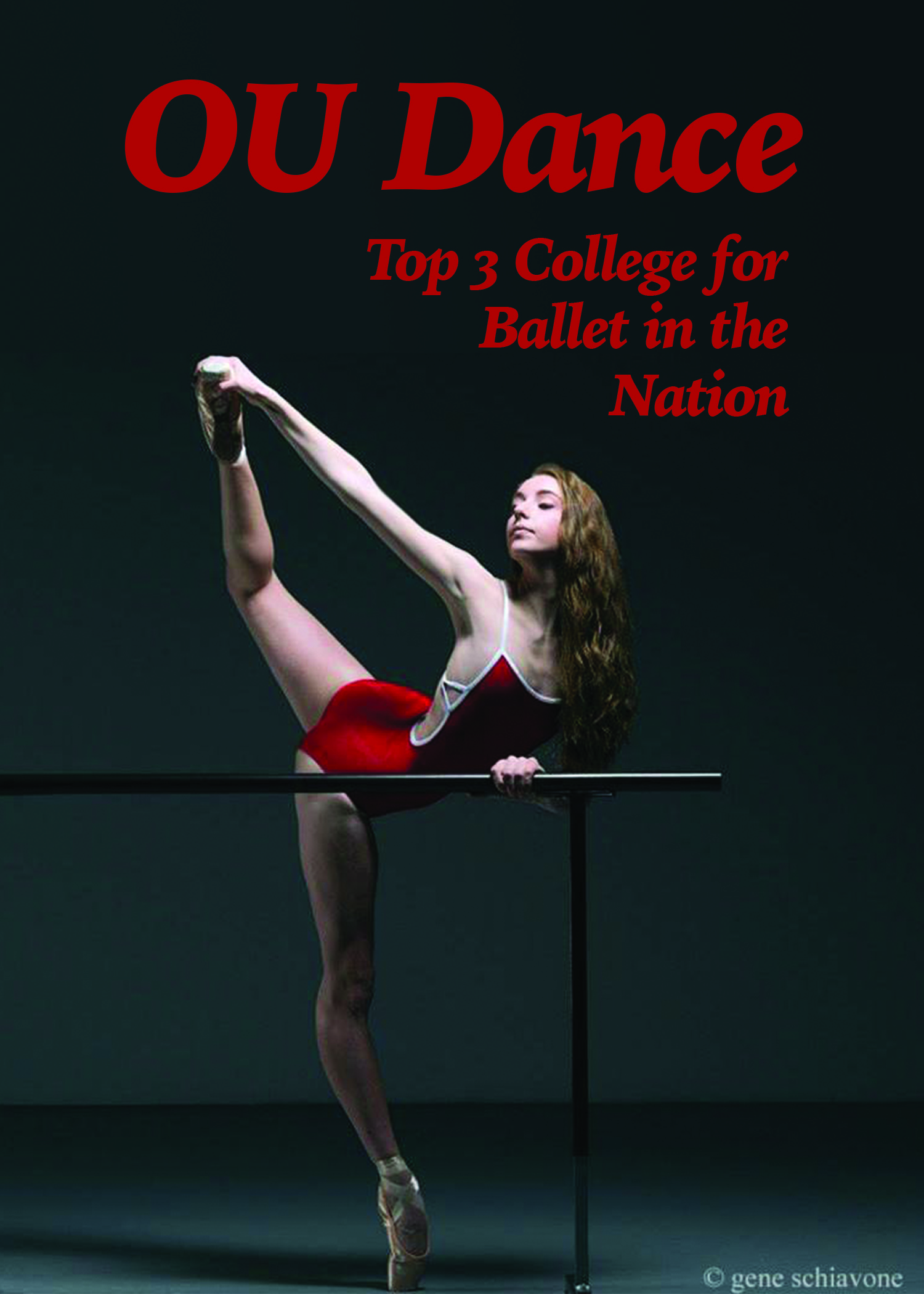
My intended audience is the parents of 17-19 year old high school dancers who intend to dance at a collegiate level. The message that I hope to send is that OU is a top quality program with great faculty.

Now, I would like to answer a few questions about this week’s project.
1. What were you asked to do?
I was asked to create a mailer for OU Recruitment Services for an audience related to the stakeholder of my first mailer. I was instructed to draft a design that would reach my target audience effectively.
2. How did you respond to what you were asked to do?
As this particular stakeholder is quite familiar to me, I didn’t feel the need to map out a stakeholder segmentation, but I did do some research about my target audience. I felt that framing the mailer in a light that reflects the quality of the program, faculty and instruction would be the best route.
3. How did react to what you actually did?
I love the front of my design, still not as enthralled with the back. The back of the design seems rather boring, but I’m not sure how to change that. I thought a letter from the director/dean would be extremely effective, but another thought I had was to place the faculty’s headshot and mini-bio’s on the back. However, that could get overcrowded and the design I chose was much more simple.
4. Now go one level deeper: Why do you think your reaction was what it was?
I liked the front because the image and the text fit together perfectly. I added more height to the original image by creating a 2-inch tall rectangle frame and matching the color gradient of the top of the original photo. This gave me blank space to place text as well as avoid stretching the image out of proportion. Finally, I matched the text color to the color of the leotard that the dancer wore. The proximity, spacing and color worked extremely well to create a well-formed image.
This week’s reflection post will consist of reflecting on both drafts of your direct mailers. Make sure that you embed both of these into the post. Write a brief reflection on the following questions?
1. How has your first stakeholder help define your second stakeholder?
Tremendously! By understanding who might first stakeholder was completely, it was very simple to cater to my second stakeholder because I already knew so much about the type of person that my second stakeholder was responsible for.
2. Has your design changed since the last draft? What influenced the changes?
My first mailer has changed. I changed the cream background color to white – it just looked messy and “gross” as cream. I would really love some input as to ways that I can spice up my design on the back of the mailers.
3. What similarities and differences have you found between Photoshop and InDesign?
I think I’m using Photoshop wrong, actually… I feel like I should be creating original content instead of just amalgamating different materials together – I could use some help there. I can manipulate images in Photoshop, but in terms of positioning and layout, InDesign is much easier! I am much more comfortable in InDesign because it feels very similar to a word-processor of sorts. Photoshop is just a completely different animal, and I am still getting used to it.
Until next time!


Comments