

Direct Mailer- Final Reflection
Okay so it has been a few weeks since I have worked on Project #2 for my PR Pubs class. Spring Break gave me some time to get more inspiration. After reviewing advice from my teacher and doing some more research, I decided to completely change the look of my direct mailers.
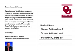
For my first direct mailer, I decided to choose a possible future student (17-18 years of age) as my stakeholder. Changing from my original idea, I wanted to reach out to Oklahoma/Texas students that are somewhat local that would encourage them to apply to OU. I thought the use of the “Sooner Magic” and OU football would really attract the excitement of future college students. Below is my new draft of this which includes the front and back of this direct mailer.

For my second direct mailer, I still wanted to use possible future parents of students who may want to attend OU as a stakeholder. Thought this direct mailer, the call to action was to get parents to sign up for a tour of the OU campus. I decided to change the picture background because of the color contrast. This picture is also a lot neater and gives a great preview of how beautiful the campus is.


Overall, I feel like this drafts are a huge improvement to my previous draft. Working with Photoshop was very interesting and sometimes difficult, but overall a great learning experience. If I could change anything about my final project, I would probably add some more color in some way. I struggled a lot with the placement of text on top of an image. Sometimes the background color would interfere with the text color.
Photoshop and InDesign are very similar, but also very different. To be honest, I had the same experience with both. At first they were both very foreign to me, but after constructing a full design project on each, I was able to learn a lot more about how to use them.


Comments