

Direct Mailer…More Draftz
So we’re right in the middle of our direct mailer assignment. For this unit we are creating two direct mailers that are meant to target two different stakeholders of the University of Oklahoma. We are currently working on second drafts and your probably thinking “Wait, WHAT?! Where were the first drafts?”
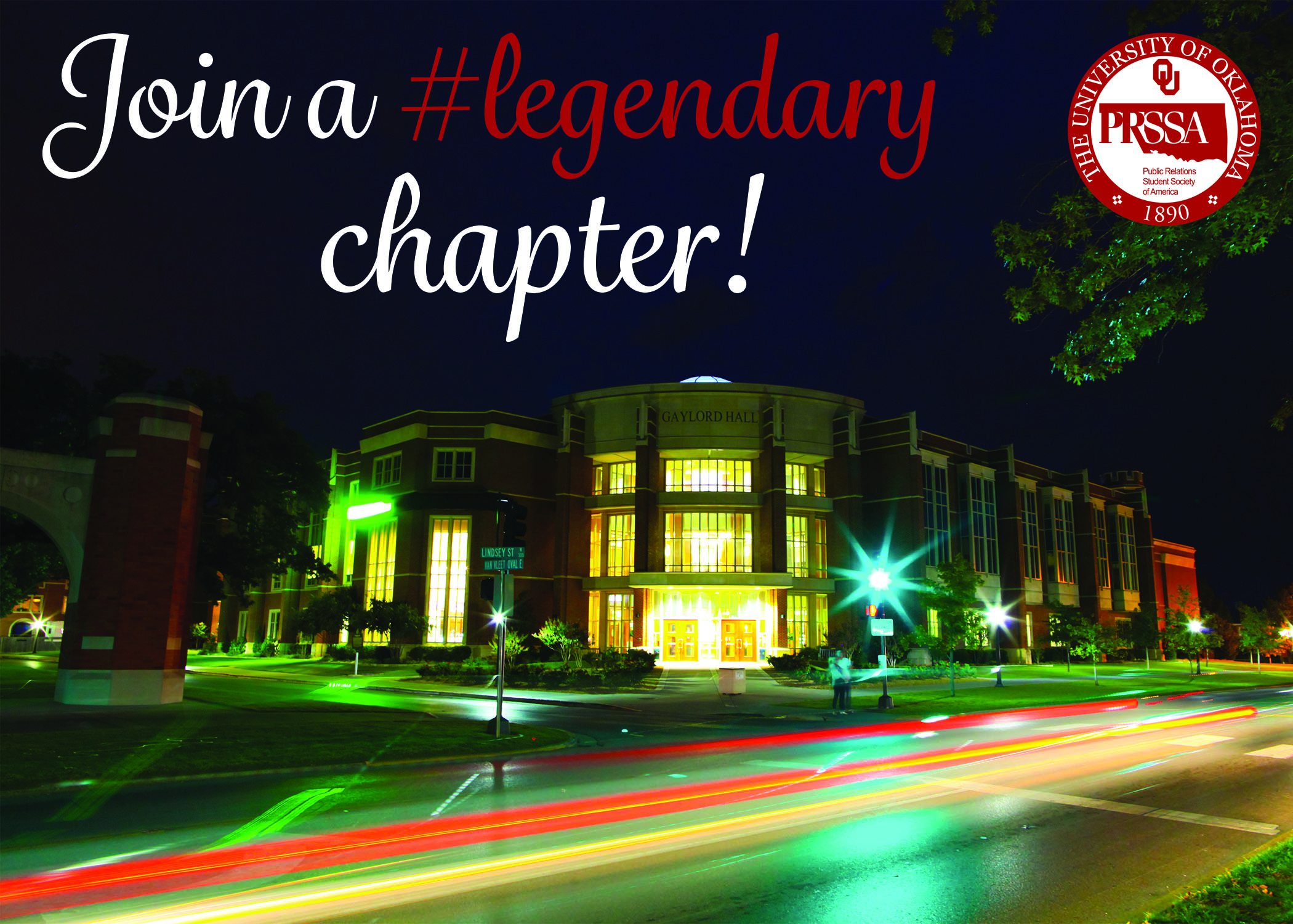
No worries! Here is the first draft of one of my direct mailers. This one is directed at current and potential PR majors who are early in the their course work so they probably haven’t joined PRSSA or they may not be students at OU yet, but have expressed interest in the Gaylord College.

Since most PR majors and most people in PRSSA are female, I gave it a feminine look. Also, you’ll notice the “#legendary” on the front side of the direct mailer. “Legendary” is the word of the year for OU PRSSA so including that will introduce potential members to the chapter’s culture.
And truth be told this is not only my first draft but also my current draft. I might have made some minor changes but it’s basically the same.
The next direct mailer was supposed to target parents with students who have just been accepted to the University and are going to attend the University in the next year. In not really sure how the stakeholder from the first mailer helped define the second stakeholder, but if I had to say something on this I would say it helped me narrow down and decide on a call to action. In my first mailer, I picked an organization that students could join, but then I remembered that there are also organizations alumni and parents can join. These parents are also alumni so what better way to get parents involved than encouraging them to become Sooner Parents!
Here is the first draft of my second direct mailer.


I tried to give this mailer a good balance of feminine and masculine to appeal to both parents and I tried to do that by combining the script typeface and the san serif typeface. I also tried to appeal to the emotions of the parents by saying that “it runs in the family” and thanking and giving credit to the parents. Once that appeal has cased some sort of emotional arousal, I introduce the call to action in hopes that parents will with want to become Sooner Parents.
To design both of these direct mailers I used Photoshop whereas in the last assignment I used InDesign. The major difference between the two is that it’s easier to move things around in InDesign because InDesign is canvas-based and Photoshop is layer-based. So, in order to move things around in Photoshop, you have to select the layer, which can get a little annoying after a while. Also, when you go to bring import different elements into our project, there are different methods to doing that. Basically copy + paste is okay in Photoshop but just don’t in InDesign.
Despite these differences, the programs are similar in that user interfaces are relatively similar. You have your tool bar on the left side, some more tools up top in addition drop down menus, and then you have some panels on the right side. Essentially if you’re looking for a specific tool in one, it’s likely to be in the same place in the other program so it’s not like you have to relearn where things are.


Comments