

Dummy Layout-Newsletter
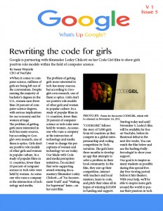
Who is the Dummy, me or the layout? For this assignment we were asked to pick a fortune 500 company to design a dummy newsletter for. We were suppose to just use place holder text but I accidentally just went ahead and found news stories, so what you will see attached is closer to a finished product. I choose to design a newsletter for Google. Not only are they a great company, but they are also a fun company with an endless list of logos to choose from. For this assignment I decided to make my newsletter for Google employees and other people like me who love Google. I titled it “Whats up Google” to show whats new in the life of Google. The news stories I choose for this newsletter are all recent events that Google is involved with as well as the most exciting ones.
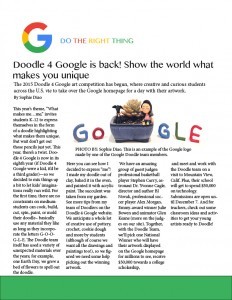
My design concept for this project was to incorporate Google’s colors into every aspect of the design. I also wanted to celebrate the fact that Google redid their logo so I choose a font that was rounded like the new Google font. I used the logo, “Do the right thing” because it is the updated motto of Google which was “Do no evil.” All of my research brought up this term, so I included it in the informational newsletter to reming Google employees and consumers to always do the right thing.
Another design concept that I tried to include throughout the newsletter is spacing and alinement. I made sure the columns were all aligned and were the same size, this makes it easy to follow and easy to read. I also included more spacing between the byline and the actual story, so the white space would make it look less cluttered and overwhelming. Throughout the entire piece I debated the amount of white space I had, but in the end I decided to keep it because it complements the different colors that are in Googles logo and it also allows the colors to pop rather than overshadow the text.
I really hope you enjoy my newsletter and like always I would love to hear any feedback you might have!


Comments