

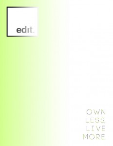
“edit.” Letterhead Draft 1

Building upon the foundation of last week’s assignment, this week’s assignment centered on the development of a letterhead to accompany and complement the design of edit.’s business card.
In order to do so, I utilized both Photoshop and InDesign to create a layout that reflected the style of a letterhead while maintaining the design principles laid out in the business card design. I continued using the theme of gradients to illustrate the idea of a light source on the page as well as convey color contrast for visual interest.
Additionally, for the slogan text “Own Less Live More,” I utilized the same font as the business card but treated its application differently. Instead of using black text color for the first half of the slogan and neon green text color for the second, I interweaved the neon green color into individual segments of each letter in the text. Furthermore, I placed a gray stroke color on the green segments of each letter in order to give dimension and ultimately further the theme of light by representing the slogan in the style of a neon sign.
Like the business card, I furthered the design concept of new and “bright” ideas by reiterating the use of light bulbs; this time, however, I cut out just one light bulb from the array of light bulbs on the business card and placed it at the top banner of the letterhead’s body text page. In this iteration, I gave it greater detail utilizing an outer glow and drop shadow to emphasize the idea of light shining on the page.
To provide a more cohesive view of the letterhead design, I also developed a mock internal memo to the “editors” detailing the arrival of a new product line, EXOvault iPhone cases, as well as plans to host a promotional event showcasing the new line.
Additionally, I made a slight edit (pun intended) to my business card by revising the body text on the back, replacing the term “Store” with “Addr” in order to maintain continuity with the general layout of business card design.


In reflection, I feel that I approached this design assignment without any trepidation and really enjoyed the process. I feel that my level of comfort with Photoshop and InDesign has increased, thereby allowing me to feel more liberated in my design process. Overall, I am happy with the first draft that I created, but I would love to hear feedback on how the letterhead or business card could be improved.
Live stylishly,
S


Comments