

Everyday Design
This week we covered some basic design concepts, and to further our understanding we were tasked with snapping pictures of these elements whenever we saw them. Here are the five photos I took this week that exemplify a concept of design. This was a fun assignment. It’s amazing what design elements you can see in everyday things if you are being just a little more vigilant.
Rhythm
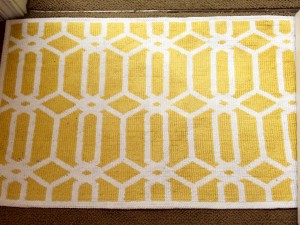
This rug from my room shows the concept of rhythm. The pattern on the rug uses repetitive elements and it is visually appealing. The concept of color is also present in the rug’s design. The yellow is a bright pop of color against the white part of the rug. This is one of my favorite rugs. I like that it’s an interesting pattern like I have never seen before and that it embodies visual harmony.
Proportion

For this picture I laid out some of my favorite items with a design concept in mind – proportion. I tried to make the items evenly spaced apart and also focused on the rule of thirds. The rule of thirds helps to guide the eyes, and after learning more about it, it was easy for me to see in a lot of things around campus.
Dominance

This image demonstrates dominance. The flower arrangement is the dominant aspect of the image and as such it gets our main focus. Since I wanted the arrangement to be the main focus I moved it closer to the camera, but I left the stuff in the background, like the chair, so they could be slightly blurred out later on. The dominant object should be easily detected but also fit in with the rest of the scene.
Color

This picture of my jewelry box demonstrates color. The box is made up of all kinds of colorful jewels and it stands out against my white wooden desk and the beige wall behind it. Naturally the eye is drawn to the pop of color, but also I noticed the line between the wall and desk drives the eye right to the box as well. The colors of this box make me happy because they are bright and fun on my desk that is usually used for more boring things.
Typography

This craft is my roommates. It shows the concept of typography. It was done by hand and all of the words are in the same cursive form. Although the “fonts” are the basically the same for each word, the color is different and the spacing between words, between letters, and between lines varies a little bit. I think the type she used works very well for the design. This craft also demonstrated the concepts of rhythm, because of its repetitive pattern, and color because the gold color pops more than the other colors.


Comments