

Eye Candy 101
Over the past week, our class studied several design elements that can enhance the message a designer would want to send to an audience. We focused on how to create simplicity, clarity and unclutteredness in a design. Our class was asked to take photos of different objects, advertisements or signs that were either visually appealing or unappealing. During my campus scavenger hunt, I discovered how design affected my feelings toward the message being sent. The following images will illustrate several of the concepts covered in our Design Blitz.
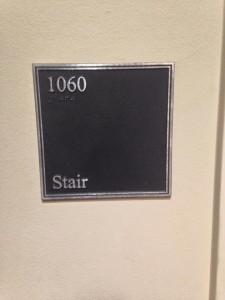
The image above is an example of alignment. The information is equally aligned to the far left of the square. Since people read from left to right, the information quickly catches their eye and is in a natural and clear format. The image also looks more visually appealing because it’s very organized. Your eyes connect the images as they are in exact alignment with each other, and this example avoids aligning the information in the center of the square, an often overused form of graphic design.

The Gaylord College “Travel Study” board provides an excellent example of repetition, as well as alignment. The images on the board, excluding the picture in Washington, D.C., are all the same size and have equal distance from each other. While the Washington, D.C. photo is larger than the others, it is still the same height as the rest of the photos, and gives the board a bit of visual flair that is appealing to the eye. Moreover, the bold, white font used for the captions of the photos is repetitious. The repetition gives the board clarity and cohesiveness for the viewer.
 The above advertisement for Crimson Park is in my opinion a poor example of contrast. While the blue and white colors certainly catch the eye, the blue color somewhat covers up the image of the college student, who should be the focal point of the image. Contrast is visually appealing when the audience has a clear understanding of where their eyes should immediately focus on the image. The white font over the blue color does not have enough contrast for the audience to be able to quickly scan and read the words. Overall I think the advertisement has potential to be appealing to an audience, however, there is a lack of clarity. The large blue coloring takes away from the focal point of the image and somewhat blends with the other colors rather than contrasting with them.
 The “Broncho Tour Kickoff” advertisement uses dominance to create a visually appealing message for the audience. The artistic image of the women’s faces are contrasting to the black and white colors in the background and large in size. This image is dominant in the advertisement because it has the most visual weight. The size shows that the designer was trying to emphasize an artistic image to help the audience grasp a feel for the event.

The typography used on the telephone booth is appealing because it makes good use of space on the white background and is consistent in size. The old-fashioned font used is also creative. Overall the image has a very simple style, but it sends a clear message to the viewer and creates a historic feel to the item. The typography is most attractive with its use of space and consistency.
The Design Blitz scavenger hunt was not only fun, but it also showed me how quickly my brain forms a response to visual elements. Within seconds of looking at an object I could decide whether or not I was receptive to the message. After studying specific design elements I could determine why I liked or disliked the design. I discovered capturing someone’s attention usually means keeping design simple and clear.


Comments