

Final Draft: Business Card and Letterhead
So this is the week! By Thursday, the Fall 2015 PR pubs class will have turned in its first assignment! For anyone who hasn’t been following the class progress, we were asked to design a business card and letterhead for an organization of our choice. I chose a non-existent organization called Native Coffee. Native is actually my dream business that I hope to own some day in the distant future…maybe by the time I’m 30…maybe by then I’ll have some money to start it up.
Maybe.
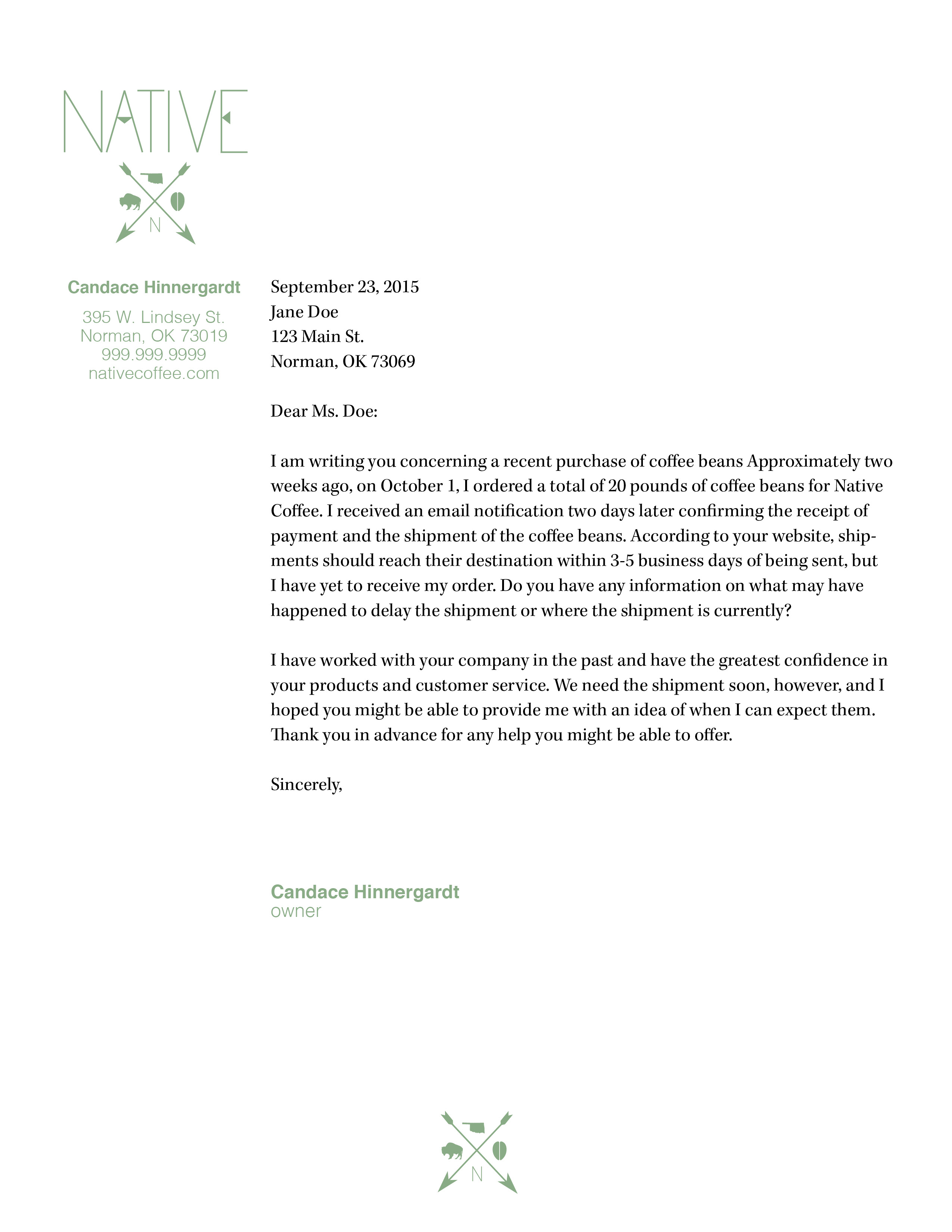
Any who…for this assignment I designed a business card and letterhead with a tribal theme and rustic elements. Below is the letterhead and if you read my last post, I felt like there wasn’t a whole lot going on in comparison to my business card. One thing I learned from our instructor Adam Croom and would pass on to any future students is that that is okay. It’s okay for your letterhead to not have a whole lot going on because you will be printing TONS of those and maybe only 200-300 business cards.
So I made some slight changes with the leading and font size of the body copy which brought me to the above design.
Now with the business card, I just made a few changes to the information on the card. It just seemed like there was a lot going on so I tried to simplify it by just including what I would have as the website, phone and email.


Overall, I’m really happy with what I’ve done. I think I’ve captured the mood I want to portray successfully.


Comments