

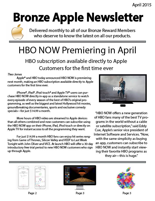
Final Newsletter Design
After being critiqued by classmates and working on the second draft of my newsletter, I feel much better about my design!
We were asked to think about who this newsletter should be sent to and what kind of information the organization should be communicating to them. Initially, I had no real outline on what I wanted to design but eventually I found my way. I decided that my newsletter should be directed to Apple rewards customers and offer exclusive information about their products or plans for the future! This is a company with a HUGE following, so I feel like something like this would actually exist.
I responded by making my newsletter look closer to something Apple might actually produce. It is very minimalist but also very sleek. I had the most trouble with the first page, but felt that the rest of the pages came together very well!


I’m happy with what I designed this week. My first draft from last week was not something that I was proud of, so I’m glad I got to turn something horrid into something presentable.
I started this newsletter with no real goal or objective in mind. I have always advised myself to just go with the flow and let the work design itself and this week I actually did it! I’m happy I finally took my own advice.
How did your target public affect your overall content and design strategy? Apple is a well known brand, a minimalistic style throughout the newsletter was a must. Also, I feel like the target public truly cares about all areas that the organization is involved in, so I included a variety of stories. The articles covered product launches, conferences and how Apple TV can now stream HBO!



Comments