

First Design Project…Check!
So, I have completed the first design project in PR Publications! The process started a few weeks ago where we were given the task to find an organization that would serve as our foundation and creative basis for a few weeks. I chose Mission Norman.
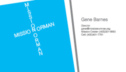
Mission Norman is a non-profit organization in Norman, OK that specializes in providing families in need with food, shelter and fellowship. I identified faith as the core purpose and existence of the mission. This message needed to be implemented in all design “theme” aspects. I started out kind of confused.Confused by InDesign and confused by what I wanted to portray Mission Norman as. Back tracking to my original Pinterest boards and original brainstorming sessions, I wanted the business card and letterhead to symbolize community, warmth, faith and service. I somewhat strayed from this concept….InDesign proved to test my design abilities. A blank canvas. That is what I was given. I had to create the borders and the shapes and the colors (it is a lot harder than it looks!). I did know one thing though. Faith and Christ had to be portrayed in my designs. This concrete concept lead to the idea of using a cross on the business card.
Here is the evolution of my business card:
Now Then


I played around with the color scheme and increased the font size. I enlarged the cross and made it more “convicting” and appealing to the eye. Now, I admit…aligning “Mission Norman” in the form of a cross was tedious! But, I think it paid off. I am proud of my final business card. I wanted to “modernize” Mission Norman since a lot of their current publications and marketing efforts are outdated. People give to organizations that are reputable and share a common vision. I wanted to create a card that would make people confident in the mission and support its values.
The letterhead was the next milestone for the design project. How would I use such a small space to make an impact? What do I want people to take away from this letterhead? I knew that a modern look that conveyed the “faith” aspect of the mission needed to be portrayed.
Here is the evolution of my letterhead:
Now

Then

The final design is bold. I decided to use the shapes to symbolize a cross. By moving the contact information to the bottom, a more sleek and modern look is portrayed. I removed the logo because I felt like the logo was random and did not add meaning to the letterhead.I am proud of my final letterhead. It represents the mission and purpose of Mission Norman- faith.
I was confused when I first was told about this project. I was not comfortable with InDesign nor knew where to begin. Each week different aspects of design were taught which added clarity to my original confusion. At first, I had in me head what I wanted my business card and letterhead to look like but it was another thing to execute these ideas in InDesign. Through the guidance of Pinterest examples and my instructor, I am now proud of my work and confident in my InDesign abilities. I think I need about two more InDesign projects to feel completely capable of using the software for a job or what not.
I think I reacted in this way because I like to have a set plan or way to do things. This project was open to creative interoperation and to trial and error. I had to clarify the confusion and create something from nothing.
As far as long term goals, I would not be opposed to pitching my designs to Mission Norman. The current publications they use are very outdated and somewhat “childish” looking. I think this could open up a really great opportunity! I would maybe think about changing the colors around a little. Any ideas on how to go about it?
If I had to start over I would probably sketch out my designs first. I need to put the traditional pencil to paper and sketch out my ideas before moving to InDesign. For all you future PR Pubs students, do not get frustrated with the software. You are learning and it is okay to not be an expert!


Comments