

Having Fun With Typography
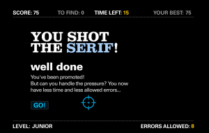
In Lesson 1.2 of PR Publications, I was asked to play three typography games. The three games that I chose to play were: Shoot the Sherif, Type Connection and Type War.
Before I began my first font game, Shoot the Sherif, I quickly realized that I did not know the difference between Serif and Sans-Serif fonts. I had to research the difference and look at the fonts before I started to play the game. During the game, the timer was going so fast, and as the game progressed, more and more letters were needing to be shot. The sound of the gun shot truly made me really into the game. I had a few errors because the letters truly seemed so similar. There were some points when I got frustrated when I was running out of time, yet I still had letters to find. This game was fun way to learn the difference between the fonts, while having a little competition against yourself.
The second game I chose to play was Type Connection. I thought the concept of this game was super cute! I first picked my favorite font out of the four, ITC Century. I thought this font was the most girly and fit my personality. My strategy was “to explore the past” because I have found that I have been wanting to explore my past lately. I thought it was hilarious who my font “daters” ended up being, and I chose ITC Franklin Gothic because I thought the description best fit my personality. I think my two fonts ended up cute together! I would definitely “send them on a date.” 
The last game I played was Type War. This game was so much harder than I had anticipated. The entire game, I could not tell the difference between the Optima and Helvetica Neue fonts. I would be on a perfect streak, and then I would mess up on these two fonts. I am happy that I have learned the difference finally!
All three games were a great way to learn typography. My favorite game was Shoot the Sherif because it was the most exciting!


Comments