

Letterhead Design
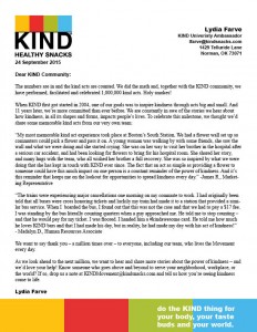
This week in PR Publications we were asked to design a letterhead that paired with our business card design for our chosen company. My chosen company is KIND Snacks. I thought this design would take a bit longer than it did, but since I came into it with an idea already in mind, I found it much easier. It also helps that I’m getting more comfortable with the tools in InDesign.
Here’s my first design:
So far, I’m pretty pleased with the outcome of this design. I wanted to incorporate KIND’s colors to reflect on the fun and friendly feel of the company itself. I also like how the motto is incorporated on both the letterhead and the business card; I think it really ties the two together. The hardest part was matching the colors from the logo to the blocks of color on the bottom, but I think I eventually found the colors I was looking for. Now I will probably go back on my business card and change the back side of it to look like the bottom border of this, with all the blocks of color. Another thing I think I’d like to change on this design is to put more space in between the header and where the text starts. As you can see, the date starts directly below the logo, and at first I think I liked the continuation of it, but now I think I’d prefer some space there.
Overall, once I change a fews things to both the letterhead and business card I think I will be really pleased with the designs.


Comments