

Letterhead Draft Reflection
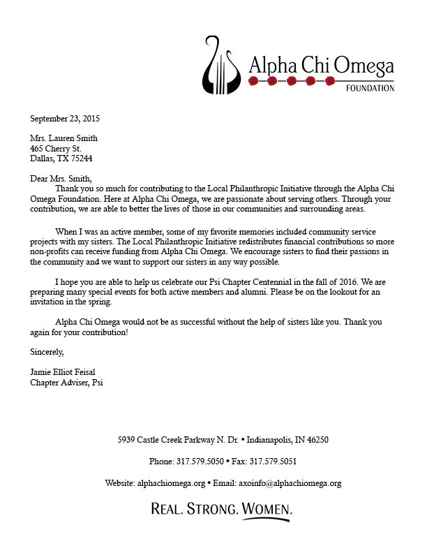
This week in PR Pubs, we were asked to create a draft of letterhead based on our business card design. The two were supposed to be connected because it was for the same organization and that organization should give off the same feel in all publications.
The fact that we did all the research and original designing for the business card helped tremendously for the letterhead. It was easier for me to do the letterhead because I had a better feel of what it was supposed to look like after the business card.
In comparison to the business card, the letterhead was much easier. It has more text so the focus isn’t just on a small card. Actually, the hardest part of the letterhead for me was writing the letter! It’s been a bit since I’ve formulated a proper letter.
I thought about what kind of letter I would want to receive in the mail after making a donation and modeled it after that vision. Of course, I incorporated the lyre and carnation symbols like I did in the business card. I added the Alpha Chi Omega tagline, “Real Strong Women”, at the bottom of the letterhead as a final reminder of the organization and what it stands for.
I have never used Canva before but I think it will be interesting to use different mediums to create publications. As a public relations expert, I feel like we should be jacks of all trades with technology. The world is becoming technology-savvy and as communicators it’s necessary that we keep up.
I didn’t have any trouble with the design process because of technology. If anything, it made things easier! However, I’m still getting acquainted with InDesign so sometimes I had to look up how to do certain things in InDesign.
I still have to perfect my letterhead but here is a draft of what it looks like right now. I like seeing my publications complement one another!


Comments