

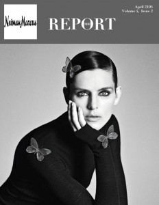
Letterhead Dummy Layout
This week’s PR publications assignment marks the beginning of a new design project in which I will have the opportunity to develop a newsletter for a fortune 500 company. The company that I chose to center my newsletter around is Neiman Marcus. I have been an observer and supporter of the Neiman Marcus brand for some time, and I chose their company because I felt that I would enjoy designing for the company as a client.
Over the next two weeks, I will create a newsletter that includes:
- One nameplate
- Headlines (for every article)
- Deck (for every article)
- Bylines (for every article)
- Photos (one per article)
- Caption (one per photo)
- At least one pull quote
- At least one jump article
- At least one article must have subhead
This week’s mission was to develop a working dummy layout in order to start understanding how to place text in an aesthetically pleasing and functional way. Below is a photo of the layout I have created thus far.

Although the layout has definite room for growth and I intend on enriching it with more details in the coming weeks, I feel that the layout thus far has given me an adequate starting point. Usually I work in a more organic way when I design, so I don’t necessarily create a dummy layout first before finding the appropriate images and text for the publication. However, I look forward to see how this newsletter evolves in the coming week.


Comments