

Letterhead Reflection
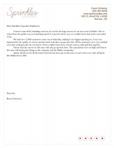
This week in my PR Publications course we were asked to design a letterhead for the same company we designed out business card for. The letterhead had to have the same feel as the business card but obviously not look exactly the same.
I wasn’t nervous at all about doing the letterhead simply because I feel like the business card helped me et used to InDesign. And a letterhead seemed much simpler, so I wasn’t too worried about it.
I was actually not very satisfied with my end product because it looked TOO simple. I though a letterhead is just straight to the point but it was difficult finding the right font to use as well the colors to use. I know I wanted it o be simple but I need to find a way to where it is more appealing.
I think I wasn’t satisfied was because I thought it was going to be so easy to design a simple letterhead but it takes a lot more to actually make it look presentable. I feel like when I look at a professional letterhead it just looks good. But more planning and playing around with the fonts and designs is necessary.
I feel like apps like Canva are very useful for people that just want a simple design and don’t want to spend too much time on it. I think it’s great because it has a variety of designs and fonts that can be used and it’s fast. But I think theres also a lot of limitations in how you can design a certain thing. Nothing will turn out exactly how you want it on Canvas, it can come extremely close but not exact. Also, it is not your design, there could be dozens of other people using that same format.


Comments