

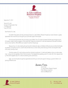
Letterhead Reflection
For this week in PR Publications, we were asked to design a letterhead that has a similar look and feel to our business card we design last week. This is a continuation of last week and my letterhead is for the same organization, St. Jude Children’s Research Hospital.
At first, I was really excited about being able to start on a letterhead. Since the page is larger, I felt like I was going to have a bigger canvas to work with and would be able to be a little more creative with my design.
Once I got started, I had already given and received feed back to some of my classmates and was already itching to work on the second draft of my business card, but I stuck with my original draft and made my letterhead to look similar to that one. I am very pleased with how they both look together and how they’ve turned out!
I think my reaction was that way because I think very creatively and cutesy some times, but for projects like these I need to tone that down and use a design style that is best for my client, not for my personal taste. I am really looking forward to getting some feedback on both pieces and hopefully making some improvements!


Comments