

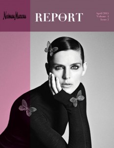
Neiman Marcus Newsletter Reflection
This week marked the finalization of the newsletter design for the Fortune 500 company Neiman Marcus. Overall, I am happy with the look of the finished product. I feel that a majority of black and white juxtaposed with blush accents added visual contrast and hopefully reflected the Neiman Marcus brand of elegance and sophistication. Images of the finished product can be seen below.


In reflection, I feel that this assignment has most likely been the most challenging one I have faced yet. It was slightly itimidating trying to maintain a subtle consistency throughout the entire publication since the length of this project was much greater than any of the previous assignments. However, I feel that I was ultiamtely able to achieve a product with which I am satisfied. I really enjoy the process of communication design for publications and I can’t wait to encounter more projects in the future.

Comments