

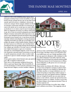
Newsletter: Fannie Mae and the Philandering Female.
So we’re starting on the newsletter in Pubs now and so far it’s been a very average experience. I remember putting together the newsletter from the first couple weeks of class and just copying a model, and that has been surprisingly helpful in formatting my own newsletter now. I chose Fannie Mae, a Fortune 500 company that was down and out during the 2008 real estate disaster in this country, but has now built itself back up to the top 20 of the 500 (AND has become profitable again). I like their logo and color scheme, real estate is an easy thing to sell in a newsletter because its a super visual business and overall I like the story of the company which is why I chose it. I’ve started with a very basic format for the newsletter, but I want to emphasize images of real properties and less textual information in the newsletter. I think that people get tired of reading about things and would much rather see them, so I’m going to make it a point especially on the middle two pages to put a lot of images in the newsletter. Hope you like it!


Comments