

Newsletter Part One Reflection
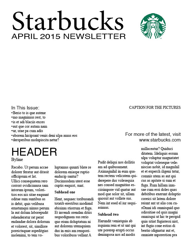
This week in class we created the layout of a newsletter for a company of our choice. We haven’t inserted pictures or articles yet, so this first step was simply about the design. I chose Starbucks for this assignment.
I was interested in this assignment and am curious to see how the articles I choose will fit into my layout and to see how many changes I will have to make. I like my first layout; however, I am wondering if there is too much text. In the next part of the assignment I will get to see what changes are necessary. I was interested in this assignment and have enjoyed it because my InDesign skills have improved a lot since the beginning of the semester, so it’s fun to use it. It’s beneficial to create a dummy layout beforehand because it makes step two much easier. You can focus on writing and creating content that will fit into the space easily.
Page Two
Page Three
Page Four 


Comments