

Newsletter Reflection

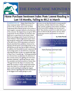
So I ended up really loving this project. I used three main colors in my design, blue white and grey, and ended up playing with gradient and color bubbles and a bunch of other tools that I think really enhanced the overall look of my project. I think Fannie Mae in general is perceived as dull and potentially uninteresting, so I did everything I could to enhance color and images and make the text seem inviting and interesting. I loved getting to line things up and add different layers of color and text boxes. Overall really fun project.


Comments