

Newsletter Reflection
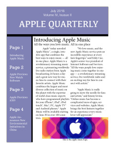
For this assignment, we were asked to choose a fortune 500 company and create a four page newsletter featuring images, text, and other typesetting materials that we learned about in the first week of the course.
We were asked to use indesign for this project, which was kind of hard for me because I feel that of all of the programs we have used so far, this is the most difficult for me to understand. It took me a lot longer than I feel like it would have if I had been using another program to create my newsletter.
Although it was difficult for me, I think that my newsletter actually turned out pretty well. I like how the layout looks and I think that I choose good images that add a pop of color and draw interest to each of the pages. It was kind of hard for me to decide which stories to use but I tried to use recent ones so that it would be relevant for this time of year.
I think that I was impressed with my work because it looks a lot better than my previous design creation. I feel that the more I use the program, the better I am able to navigate through it. I like things to look a certain way when I created them and although it was difficult for me to get to what I had imagined, I feel like I eventually got there.
Since my target public is apple users, I think that I did a good job of choosing articles that the target public would be interested in reading. I believe that apple is a company that thrives on being able to constantly update and created new applications and thing so focuses on these kinds of articles was my main tactic to draw in the reader.
Here is the final draft of my newsletter:


Comments