

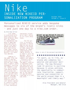
Newsletter Reflection
These past two weeks in my Public Relations Publications course we were asked to design a newsletter for a fortune 500 company. I chose to design my newsletter for Nike.
In the beginning of this project I was a little nervous to dive back into InDesign and go more in-depth than our previous project. I was also a little nervous I wouldn’t remember what I was doing.
Designing the dummy layout was WAY more helpful than I ever thought it would be. I think that it basically set the stage for me to design my entire newsletter. Also I really loved getting feedback from my peers on how they thought my dummy layout looked. This feedback definitely motivated me to make some changes to my final newsletter and inspired me to spruce things up a bit.
I think I am proud of my final product. I really enjoy the font that I used on the final newsletter and I think that this font could be used on an actual Nike newsletter. I also am proud of myself because the articles that I found were articles that I enjoyed reading. I wish on a newsletter you can include video because Nike’s Christmas commercial is absolutely amazing right now. I am slightly annoyed though that there were not any author names under any of the articles which I found all on the Nike website. I really hated having to improvise for that section.


Comments