

Now You See It
I very much enjoyed the “Design Blitz” assignment. It forced me to look at advertisements, book covers, posters, logos and many other objects in a different way.
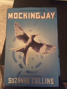
The first object I chose to take a picture of the cover of Mocking Jay, written by Suzanne Collins. I thought this book cover was a good representation of the Color category. The reason I believe this works for Color is because if you have read the book you know it is suspenseful and intense. I think the combination of the lighter blue and the bold silver text helps to create that illusion. I also thing the shadowed bird in the center of the cover helps to create suspense as well, because it seems as if the bird is frantically flying away from something…. but you don’t know from what!
The second object I picked to photograph is a Starbucks cup. I used this for the Metaphors/Symbols category. The reason I chose to use this is because I feel as though it is common knowledge that every American can look at the green mermaid lady Starbucks symbol and know exactly what it is without requiring any words. This creates great Advertising for Starbucks! Their symbol is popular, recognizable, and well perceived. If you see anyone holding that little green logo on a cup, you know they have bought a high quality coffee!

The next object I decided to take a picture of is a picture of the cover of my daily devotional book. I decided to use this book for the Form/Function/Message category. The reason I decided to use this book cover is simply because of what I thought of when I bought it. (Which was during the beginning of January.) When I went looking for a new devotional, I was looking for something fresh and new… something that didn’t look like my other past devotions. As I was walking up and down the rows of the bookstore, I stumbled across Devotions For A Healthier You, written by Katie Farrell. I was instantly drawn to it at first because of the way it looked, (it’s form). Then looking a little closer I noticed that the cover expressed that this devotional would be good for growing the “Mind, Body and Soul” (it’s function) which drew me in even more. After analyzing the cover, I knew this was the kind of devotional I was looking for simply because it was unique and I knew I would be able to learn many different things from it (it’s message). PSA: I love this devotional and I would recommend it to anyone!

The next object I photographed was the door to Gigi’s Cupcakes. (Please ignore my reflection through the glass.) I work at Gigi’s and I absolutely love it! The store is decorated beautifully and the cupcakes are delicious! (If you have not had one… trust me you are missing out!!!) However, one thing that I have particularly always loved about Gig’s is their logo. I chose to put Gigi’s logo under the Typography category. The reason I did this is because when you look at the logo it helps to tell a story of Gigi’s Cupcakes. a person can kind of get a feel that Gigi’s is a cute, little, girly bakery, due to the thin curly and cute letters that the name is written in. Next to the name is a cute little pink cupcake that helps to let a person know that yummy cupcakes are right inside the door and that you don’t want to miss them!


Comments