

PR PUBS: Design Blitz
PR PUBS: Design Blitz
Color, Symbols, use of space:
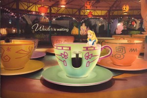
The first piece I chose was a brochure that I received from Walt Disney World. Being a big Disney fan I was excited to be able to use this example. This is a picture of the cover of the brochure. This speaks to several of the design concepts in my mind. This cover uses color in a way that is exciting and fun. In addition, it uses symbols, for many people the tea cups at Magic Kingdom is an iconic symbol. Not only is the ride in itself symbolic, the placement of Alice from “Alice in Wonderland” riding the ride is symbolic as well. I think the typograph is actually minimalistic in comparison to the rest of the image. Overall I think this design was done very well, which does not surprise me seeing as it is a product of Disney.
Use of space, balance:
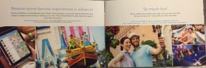
The next piece I chose is still Disney related, it is a page within the brochure. This contains a lot of text and I thought it was a good example of how they chose to organize their text while still drawing consumers into their product. Essentially the proportions they use are not even but they are effective. While the copy in this brochure is important I think it is equally important to show potential customers the experiences they could have while at Walt Disney World. While the space is not symmetric the use of colors and symbols really pops in order to intrigue the audience.
Metaphors/symbols, balance, Color
This next advertisement is from a box that is surely well known. It is a red bull box. I feel as though the textured water droplet feature really speaks to the metaphor that this product can quench a person’s thirst. I think it was a great design aspect because it is subtle and not overwhelming. The balance in colors in this advertisement is also clearly strategic and works well. The colors also come together and give it an American feel

Comments