

PR PUBS: Newsletter Reflection
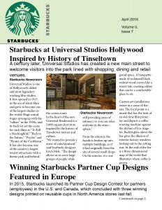
This week in PR publications we were putting the finishing touches on our newsletters. I chose Starbucks to create a print newsletter for. This week I had to chose the right stories and pictures for the newsletter. In the end my design ended with three different types of font because I wanted there to be more of a dynamic and for the headlines to stand apart more than they did. Some of my placement in the last article was frustrating because I could not get a picture to fit neatly without having some white space and it bothered me. However, the experience was fun as usual getting to know InDesign more is always something I can look forward to. All in all, I do think the entirety of my design is pretty cohesive as well as spaced appropriately. The public that I think would be most appropriate for these articles would be either really huge Starbucks fans and/or stakeholders that possibly own stock. However, these stories were all news worthy and could have been presented from a number of resources and for a number of people. Therefore, I wanted to make sure the design was readable and versatile while still being crisp and clean. I think it achieves that purpose but I do wish I could have perfected the spacing between the last picture and the end of the text.


Comments