

Reflecting on the Direct Mailer
Over the last few weeks, we’ve been working on a direct mailer in my PR publications course. A direct mailer is a piece of mail sent without an envelope, often by colleges and universities, to call a public to act.
In my case, I designed a mailer for two specific publics: Dallas-area high school seniors with an average family annual income of $100,000 or more, and their parents.
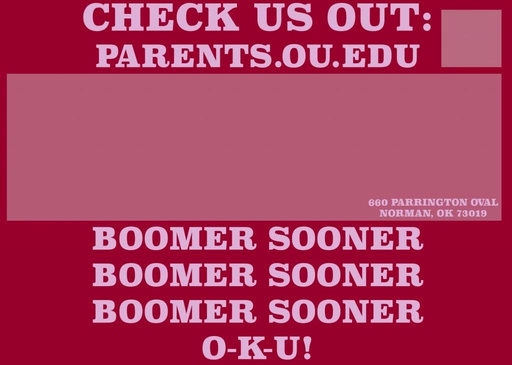
The photo above is the back of my parent’s mailer; it’s the only one that has changed significantly since my first drafts were posted.
Overall I’m very happy with my mailers. I think they hold up fairly well when compared to some of the actual stuff that OU has mailed out, especially the one I made for students. And compared to my business card–well, there is no comparison, really. I guess this means I’m more comfortable on Photoshop.
I really enjoyed learning how to overlay two images. In this case, I used texturally rich images to give my mailers a more retro, or ambient, feel. While the photographs themselves were sufficient, it was obvious that overlaying effects made them more interesting and eye-catching. Wealthy Dallas-area seniors are inundated with mailings from colleges; if OU has any hope to stand out, it will have to use methods like this.
I’ve always been a fan of minimalism–when I acted and directed stage plays, for instance. Here, I used minimalist ideas to inform my “calls to action.” “Cross the River” and “Check Us Out” might be vague, but I’ve always been intrigued by messages like this and I think my publics would be as well.
Perhaps my favorite thing about my mailers is the font I found. It’s a bold, assertive, all-caps serif font that grabs attention from the outset. It was cool to see all the fonts Photoshop has to offer. I rarely find exactly what I’m looking for when I choose a font, but this time I think I did.
Thanks for everyone’s help on this! It feels good to have made something not awful.


Comments