

Reflection
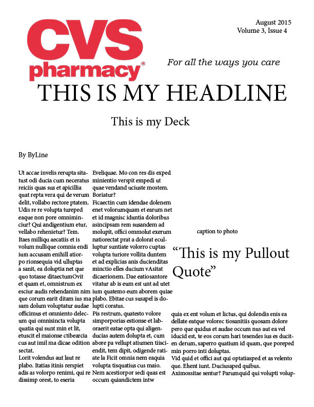
This week in my PR Publications course, we were asked to design a newsletter for any Fortune 500 company of our choosing. I chose CVS pharmacy. NOT because it was on the top of the list, but because it is visited by me or my family on a daily basis.
Although this is an EXTREMELY rough draft, I enjoyed getting started on my newsletter today. After looking at some of my other classmates, it is clear that I need to add a little more color and pop to the top and throughout my news letter. I have found a few stories, but I am anxious to see what else I will come across. It’s also clear that I need to break up the text a little more to make it more appealing to the naked eye. I think with some more work, this newsletter could be great!


Comments