

Reflection
Taking It To The Next Level
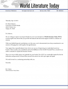
This week we continued the project of making our business cards better. The class was also asked to design a letterhead that would suite the business card design.
As you remember, I chose to make my business card over the international magazine, World Literature Today, where I serve as a public relations intern. In my design I wanted to focus more in the competitive advantage the magazine has for being one of the fewest international magazines. I also wanted to demonstrate unity literature from other cultures brings to our world by using the outline of the world I used in my business card.
I used a simple design on both the letterhead and the business card because apart from all, I didn’t want to keep focus from the main focal point: the WLT logo and my contact information. I agree with the design element of simplicity. I think that a design can speak more without actually having words, if the elements such as space, color, alignment and typography among others are used properly.
 Front
 Back
This week I also corrected the alignment of the back of my business card so it can be easier to read and the spacing can compliment the design better. I also expanded the “WLT” logo so the brand could be present more.


Comments