

Reflection
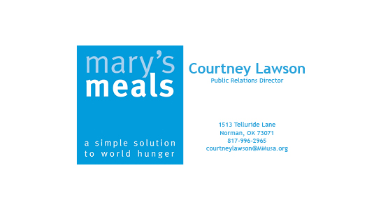
I have finally arrived at the finished product of my Business Card and Letterhead for Mary’s Meals (YAY!)
I’m trying to stay cool, calm and collected but low key my heart is beating rapidly because of course I’m nervous about what people are going to think of my finished product!
For this assignment in my PR Publications course, we had to create a business card and letterhead of any organization of our choice. I chose Mary’s Meals (as explained in previous posts) and created not one, not two, but honestly about 10 drafts. One might look at the original draft and the finished product and think, “Did she really re-do that 10 times?” Your answer is yes. I’m one of those people who will have a first draft, change everything and think I’m on a completely new path, add in elements that I liked in my first and end up with a product close to my original design. I’m complicated, I know. At least I know if I spend enough time getting the elements exactly where I want them, I’ll be satisfied. In addition to this, I sort of have an interesting story with my letterhead. I know you might not believe I spent hours on it because it literally looks the same, I felt the need to tell you that I FINALLY found the right font to match the Mary’s Meals logo (this took a lot longer than expected!!) and I was extremely thrilled about this. I also completely changed the letterhead. I literally centered everything at the top and put the logo on top of my contact information and then stared at it for a solid 5 minutes and just thought to myself, “No. This doesn’t work.” I was so upset because I spent a solid hour and half moving everything around and changing elements and I didn’t like my finished product. I then tapped a random boy sitting next to me and showed him the two letterheads side by side and asked which one was his favorite. You probably guessed it, he picked the original. *sigh* I was a little upset but a little relieved at the same time. I then explained to him that was actually the original, but it made me feel better that someone else felt the same I did on the drafts and I wasn’t crazy. So weirdly enough, my draft of the letterhead ended up being the final of the letterhead, but I did clean it up and change the fonts! I just didn’t have the heart to take out the image at the bottom. I think it stands out from any other letterhead I’ve ever seen and I just felt like the top was a lot cleaner with opposite alignments.
Okay story time over….
This week I also received feedback on my first draft from classmates. I was actually excited to receive the feedback because I was curious of the outside opinions on something I created. It was interesting reading the feedback because even when I received comments on elements I should change I thought in my head, “Yup, this person is absolutely right.” One comment that spoke out to me was when someone said I needed to include a logo on the back image. At first I kind of thought that was crazy because the image is so powerful, and then I realized I could add a white outline of the logo at the bottom right corner of the image. And I loved it. I was able to guide my final draft through these helpful comments. In the end, I felt at ease with my final product. I think the message and design is exactly what I envisioned and the fact that I made it come to life amazes me.
As far as the actual product, I think I could actually use this design. Mary’s Meals is an organization that is very near and dear to my heart and eventually working for the organization would be an awesome experience. I never originally thought about pitching this to the organization, but after I saw the product I realized it couldn’t hurt. The worst thing that could happen is the organization say they don’t want to use it, but you’ll never know if you don’t try, right?
I’m very proud of myself for finally getting comfortable enough with InDesign where I don’t have to YouTube tutorial every 5 minutes when I need to figure out how to change the color of font or place an image a certain way.
If I were to start over, I definitely wouldn’t ditch this product, I would just create another. I think I might try to incorporate the outline of Africa since that is primarily where the kitchens are built. However, I’m very satisfied with the outcome of my product and I think it gets the point across in the best way possible.
The recommendations I have for future students doing this project include setting aside hours to work on it. You can’t knock it out in 1, or even 2. You need to have a massive gap of time you can spend, because when you get on a roll in InDesign it’s hard to stop and you start changing all the elements and you check your phone and 2 hours have flown by!
Mary’s Meals Business Card:

Mary’s Meals Letterhead:


Comments