

Reflection
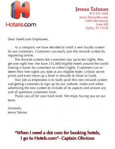
This finished product is here. Kind of scary to think about but none the less we made it this far. This week for our assignment we were asked to put the finishing touches on both our letterhead and business card we have been working on the past two weeks. Of course I spent these two weeks really thinking about the design I wanted for my business card and letterhead and how to execute that. I spent lots of times coming up with different drafts and I think I have found one that I am officially happy with. I chose Hotels.com as my organization and if you know anything about the company you know they have many different advertisements that I could model my business card after. From my first business card I just incorporate Hotels.com colors and logos but for my final draft I decided to go with “Captain Obvious” and that theme also transitions over to my letterhead. Captain Obvious is Hotels.com’s mascot. He is in alot of their commercial and graphics online and magazines. I chose him because to be obvious I’m not a huge fan of Hotels.com logo and I thought he would stand out more. I made the front of the business card into a hotel key to give it kind of an edge and not just another business card. I thought that element might make it memorable.
When we first go this assignment I was really excited to begin. As it went on I began getting frustrated because of my indecisiveness and my poor InDesign skills. But as the week went on and I was getting the results I wanted, I was actually having fun designing. When I finished my product, I was actually surprised that it didn’t look half bad. I think everything I use InDesign I end of surprising myself because I think I am so bad at doing stuff like this. But as I continue to practice I feel like I’m getting better. I just need to have more faith in myself.
I was really excited to get feedback from my peers and see what they thought. Most of the stuff they said I totally agreed with. It is always nice to have a fresh pair of eyes look over your work and see what you don’t see. I don’t really have any long term goals for this design. Maybe keep working on it and tweaking it. I have no intention of pitching this to Hotels.com but it would be super cool if they did look at it and gave me some feedback.
I am slowly but surely feeling more comfortably with the design tools. I only had to watch two tutorial videos this time, which is an accomplishment in itself. But practice makes perfect.
I think next time I would have a clear cut idea of what I was doing and really do research before I began working. I think I would try to find a font more similar to the Hotels.com one and continue to play with the idea of it being a hotel key card.
For future students working on this project, I would say really explore exactly what you are going for on your designs before you begin creating them. Have a solid idea of what you are going to do. Brainstorm. A LOT. I am slowly but surely feeling more comfortably with the design tools. I only had to watch two tutorial videos this time, which is an accomplishment in itself. But practice makes perfect.
Here is the final products!!


Comments