

Reflection
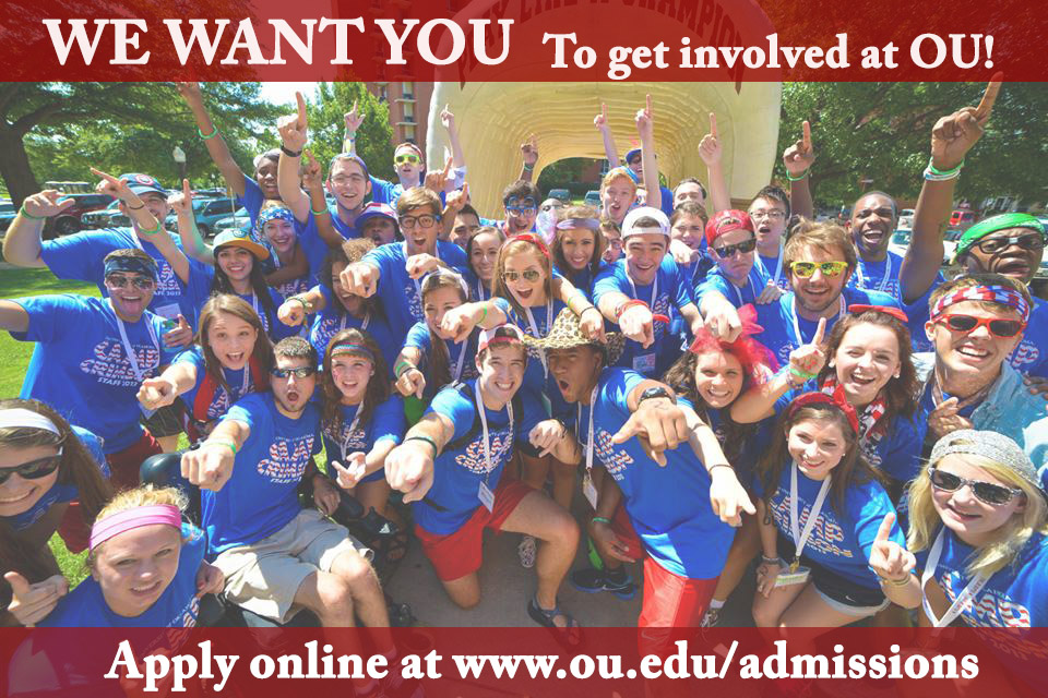
For this lesson in my PR Pubs class I was asked to design two direct mailers for two different stakeholders. I chose to design a direct mailer for a female, senior in high school who was actively involved in leadership programs at her school, and wanted to continue being involved in college. My second stakeholder was the mom of my first stakeholder, who is an alumni of the University of Oklahoma.
In designing my direct mailers, I referenced examples online to understand what a direct mailer needed to incorporate. For the senior in high school, I designed a direct mailer that included many different involvement opportunities offered at the University of Oklahoma and a call to action. For the mother, I designed a direct mailer that would pull at her heart strings because she would want her daughter to go to the same school that she attended.
It took me awhile to get to my final product, I had a hard time with readability and proper alignment. My finished product is much more readable with the use of rectangles to off set the white font, it incorporates crimson to represent OU’s school colors, and uses attractive images of the university and its students. I think that with more practice my direct mailer could be improved, but for right now I’m satisfied with the work I did. I definitely feel myself becoming more confident with Photoshop, though it’s always through trial and error. Figuring things out for myself may take longer, but it helps me truly understand the tools I’m working with.
First Direct Mailer

Second Direct Mailer


Comments