

Reflection
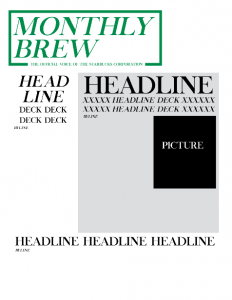
We were asked to create a dummy layout for a newsletter in InDesign. My heart sunk when I found out we were going back to InDesign because I much prefer Photoshop, however I can see the advantages do laying out a newsletter in InDesign versus Photoshop. We were to chose a fortune 500 company and I chose Starbucks. I figured their brand is something I know so when communicating it I could do it justice. The further I got into my design though I realized that not much of what I know how to do could probably do their brand justice. However, I was going to try. I like what I did. I think it communicates the brand and hits all of the design features we were asked to hit. The only one that worries me is white space, but I think that once I have actual headlines and texts in it then I will be able to assess more so if this is a problem. I think I like my design because it is starting to become more modern. Canva kinda helped me to see what fonts can do when you keep it pretty minimal.
I have never been a been a rough draft before the paper kind of girl, but without this mockup layout I don’t think I could have done this assignment. The benefits of the mockup is that I was able to focus more on the design element of the layout and less on the actual text. I think it made a huge difference.


Comments