

Reflection: Direct Mailer
For this second assignment, we were asked to create two direct mail postcards using Photoshop and we were to approach this assignment as if we were part of OU’s recruitment services trying to get new students to come to the University. In this postcard, we could be trying to get a potential student to apply to OU, we could be trying to persuade them to make OU their final decision, we could be trying to get them to choose a particular college, major or student organization. Also, for our second mailer, we needed to target an audience that could essentially influence our first one.
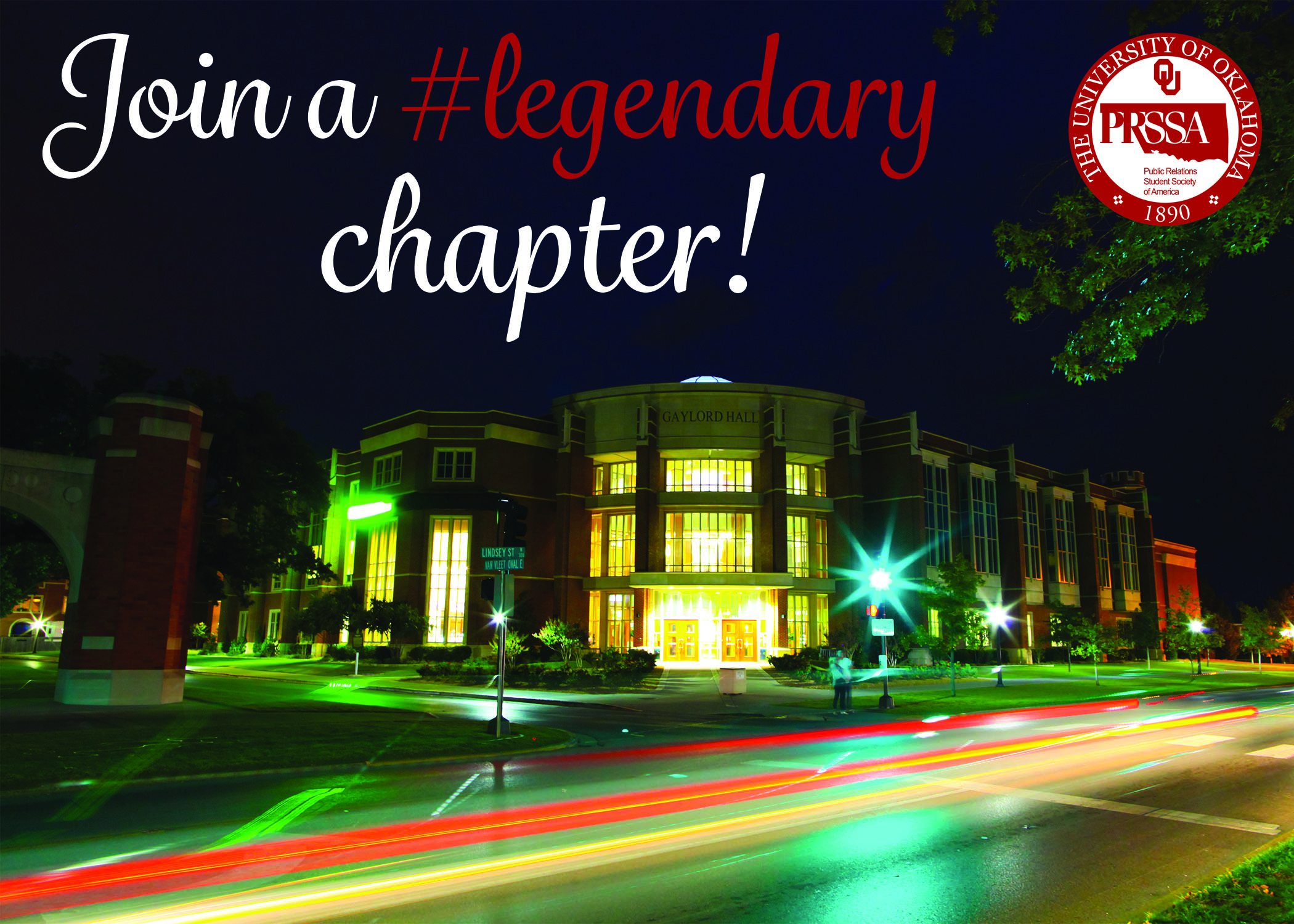
For the first mailer, I choose to appeal to potential students and underclassmen who marked journalism as an interest on their application or that have declared PR as their major. With my mailer, I wanted to get potential Gaylord students to learn more about PRSSA and potentially join. I don’t know if this was technically allowed, but I went with it!

Here is my thought process behind the first design:
Since most PR majors and most people in PRSSA are female, I gave it a feminine look. Also, you’ll notice the “#legendary” on the front side of the direct mailer. “Legendary” is the word of the year for OU PRSSA so including that will introduce potential members to the chapter’s culture.
For the second mailer, I choose to appeal to parents of students how have been accepted. These parents are also alumni and I wanted to encourage them to become a Sooner Parent.


Here is my thought process behind the second design:
I tried to give this mailer a good balance of feminine and masculine to appeal to both parents and I tried to do that by combining the script typeface and the san serif typeface. I also tried to appeal to the emotions of the parents by saying that “it runs in the family” and thanking and giving credit to the parents. Once that appeal has cased some sort of emotional arousal, I introduce the call to action in hopes that parents will with want to become Sooner Parents.
I really like what I’ve created, but I was kind of nervous about using the same script font on both designs. Figures crossed that it doesn’t look like a cop-out!
Coming into this assignment I wasn’t super comfortable with Photoshop. True be told I prefer Illustrator, InDesign and THEN Photoshop (I think I’ve mentioned this before). But this was a great way to force myself to use Photoshop! I still prefer InDesign over Photoshop, but I think I feel more comfortable in it now.
If I were to have this to do all over again I think I would have made one of the designs more typography based. I thought of an idea of this other direction after I was done with both designs.


Comments