

Reflection & Letterhead Design
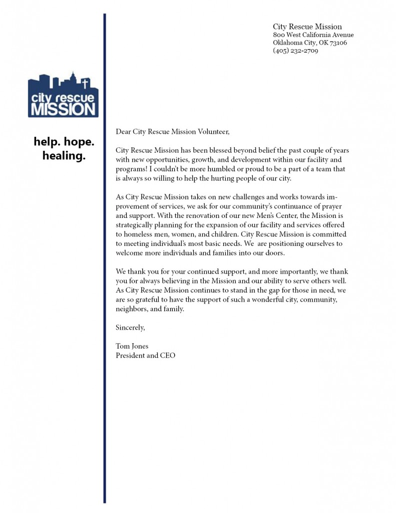
This week we were asked to design a letterhead to go along with the business cards we designed last week. The letterhead was created for the same organization for whom we made our business cards and was supposed to have a similar look and feel.
(Just as a reminder: I chose a nonprofit called City Rescue Mission in Oklahoma City as my organization.)
As with my business card, I tried to keep the design of my letterhead as simple as possible. I used a similar color scheme and fonts in order to be consistent. I also included the organization’s mission under the logo in order to ensure that it is present in all correspondence between the nonprofit and outside recipients.
I felt like designing the letterhead was a fairly easy process and I enjoyed it. I don’t think there is really a need for the letterhead to be super complicated because it will distract the reader from the content of the letter. As a result, I didn’t feel the need to make the design very complex.
I look forward to receiving feedback on this project. I feel like I did pretty well!


Comments