

Reflection on First Design Project
It’s week 7 of the semester and the first design project deadline is finally here. Over the past few weeks, I (along with the other students in my PR Publications class) have been going through the process of designing a business card and a letterhead. This process began with selecting an organization I cared about and wanted to design for.
The organization I chose was Moe’s Southwest Grill. For those who haven’t been lucky enough to experience Moe’s and learn for themselves what it is, it’s pretty much exactly what it sounds like. Moe’s is a “fast-casual” restaurant chain that began in Atlanta, Georgia and has expanded to nearly 600 locations today. When I’m home in Indiana, I work for Moe’s both as a caterer and and in-store crew member. I love it. The atmosphere is great and the food is awesome. Moe’s is one of the things I miss most about my hometown.
After I’d made my selection, I researched my organization of choice as well as some competitors of this organization. After using the Analysis-Synthesis bridge model to help me gain information, I began designing. I started with an initial draft of a business card. My business card didn’t even include a back, so there was definitely work to be done. That being said, getting the ball rolling can often be the most difficult part of a task for me. Once I had a starting point to work from, I think it became a lot easier for me to design something I actually liked. My classmates and instructor weighed in on my design and I got more detailed feedback from my learning circles. This feedback helped me make revisions to my business card.
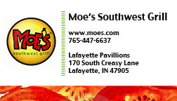
Throughout the revision process, the layout of my business card stayed generally the same. However, this doesn’t mean that I didn’t make changes to my business card. I replaced the yellow border on the bottom with a tomato border, which sounds weird but actually looks pretty good. I used the same image of the tomatoes on the back of my business card, which didn’t previously exist.I changed some colors, made minor changes to some fonts, and finally had a business card that I was pretty happy with.
Similarly, the initial idea of my letterhead didn’t change much. I made the logo a little smaller to leave more space for a letter…which is probably an important thing to keep in mind when designing a letterhead. I also changed the look of the contact information in the upper right and while it still looks a little strange to me, it looks a lot less awkward and out of place than it did. Attached below are the end results of this design project.


So that’s a run-through of what this design project has been like for me. Essentially, we were asked to design a business card and a letterhead. I completed the task(s) and I feel pretty good about what I came out on the other side with. It’s nice to be writing one of these posts and not feeling like my stuff looks super shoddy. I feel like I’ve come a long way in the past few weeks. Positive feedback from the people around me helped a lot as well.
I guess I don’t really have any long term goals for my designs. I enjoyed designing for Moe’s, but at no point along the way did I assume my designs would actually be used, nor did I aspire to pitch them to the organization. I do feel myself becoming more proficient and confident with the tools we are being asked to use for this class. I can’t think of anything I’d do different design-wise if I were to start from scratch. I would try to convince myself to chill out a little more the second time around. Similarly, I’d recommend that any students who go through the project at a later date not be too hard on themselves and give themselves time and space to figure things out along the way.

Comments