

Reflection on Letterhead
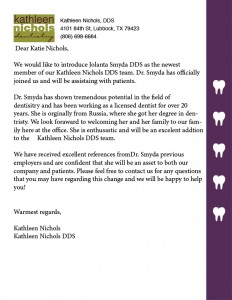
For this assignment we were asked to create a letterhead for the company of our choice. For this assignment we had to create cohesion between the letterhead and our business card. For this I knew I wanted to incorporate my tooth design into my letterhead, however I didn’t want it to be too similar to my business card. It took me a few tries and a lot of clicking command z (undo) before I had a design I liked. I like the design I made! I am open to recommendations for how I can improve the overall look to make it more appealing to the viewer!
My reaction to this assignment was one of excitement and a little uncertainty. While I like my design, I think I feel uncertain about it because I’m not sure if I’m utilizing my space well enough! I think design can be easier with certain apps however I hold the opinion that adobe products allow you more creative space to create, even though they can be confusing.
Below I am attaching my letterhead for Kathleen Nichols DDS. Hope you like it and I welcome any feedback!


Comments