

Sometimes Learning Can Be Fun
This week in my PR publications class, we learned about typography and the various elements of design. To enhance our knowledge of these terms, we got to play some Internet games.
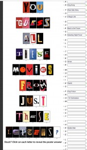
The first game that I played was called “Poster Letters.” It showed single letters from famous movie posters and I had to guess the movie. I like to think of myself as a pretty big fan of pop culture in general, though I tend to be more interested in music than in movies. Nonetheless, I still expected to do pretty well.
I was immediately able to recognize some of the letters, such as the “S” from Shrek and the “S” from Saturday Night Fever. However, the task proved to be much harder than I had expected. I only ended up getting 9 out of 46 letters right. Some of the letters I would have never been able to guess because they came from older movies that I had never seen. Still, there were some letters, such as the “J” from Jurassic Park, that I was unable to recognize and wondered why.
I liked this activity because I was able to see just how big of an effect the way in which words are typed can have on an audience. I probably would not have been able to recognize the “S” from Shrek so easily if it weren’t green and adorned with Shrek’s ears. That also led me to realize how the font and color of font can actually give hints as to what a story, in this case a movie, will be about. For example, the “U” from A Bug’s Life has a bug shape in it.
The second game I played was called “Type Connection,” where the player selected a font and had to find its 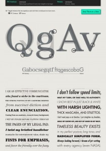 match. The fonts were personified and the game was set up as a dating game. The first time I played, I chose the font “Archer”. It took me a couple of tries to finally match the font with the correct font. Because I struggled the first time, I tried again and the second time I was able to make a match much easier between ITC Century and Futura. I was able to see the distinct differences between the two–ITC Century has a serif and is much rounder, while Futura has no serif and is more sleek and sharp.
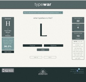
The last game that I decided to play was called “Type War.” I was shown a letter and I had to guess the letter’s font. After playing a while, it became easier to remember which fonts had a serif and which didn’t. I was also able to begin to notice how some fonts are more rounded and wide, whereas some of the other fonts are sharper and narrower.
Overall, I liked this lesson because I felt like I didn’t know much about design coming into this class, but I feel more comfortable with it now. I also liked this way of learning because it did not seem like learning when I was playing each of the games.


Comments