

Summary of Learning
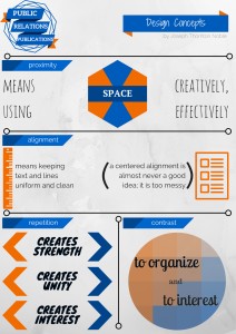
For my Summary of Learning project, I decided to make an infographic using Canva. At first, I wasn’t sure what I wanted my infographic to be about–I just knew I enjoyed using Canva. I decided to inform the viewer about the four main design principles that we used in this class: proximity, alignment, repetition, and contrast.
I wanted each section to describe visually what each concept represents. I decided to use orange and blue as my main colors since they themselves contrast. I used a bit of white space at the top of the publication, but used it minimally overall.
This project represents all that I have done over the semester. These four basic design principles were the root of all of my designs and played a part in everything that I did in this class.
I am very happy with how this infographic turned out. I would definitely not have been able to do it at the beginning of the semester–not because I couldn’t have figured out how to use Canva, but because I lacked the vision and design knowledge to complete the task. My work at the beginning of the semester wasn’t at all bad, it has just come a long way since then.
I was happy with the course format as well, I just really wish my schedule would have allowed for me to take it in person instead of online. That being said, the online course was so well organized and feedback was so readily available that I sometimes forgot that the course was actually online. Design is without a doubt something that interests me and I hope to take more design classes before I graduate.


Comments