

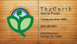
This..right here…is my…DRAFT.

This week for my PR Publications class, I was asked to select an organization to create a letterhead and a business card for. I chose The Earth Natural Foods, which is a local café, deli, and market. I researched the organization, its competitors, and made some Pinterest boards about my inspirations and what mood I wanted to achieve with my project.
The local competitors of The Earth aren’t organizations that have a lot of media presence. I used another competitor, Whole Foods, as a media reference, even though the closest Whole Foods location is in Oklahoma City. I think Whole Foods has some great ad campaigns and I like the typography they use. I was able to look at a Sprouts pamphlet that had some neat typography as well.
I have never used Pinterest before and, being as technologically inept as I am, ended up posting all of my pins to the same board at firs. I had to do the tedious task of rearranging them. It wasn’t terrible, just a lot of clicking.
I thought I would never get this business card draft done, but I did and I am fairly happy with the outcome. It isn’t perfect, but I think it is a solid draft.
I think I would be happier if I got to use the color palette I originally wanted, but the organizations logo already has a lot of color, so I feel confined to the colors represented there. Plus, I don’t want to go overboard with the color. I thought about actually recreating the company’s logo (it isn’t a great one), but I decided that it would take too much of my precious time. I also haven’t yet received a high-resolution version of the logo, but I talked to the owner in person and they said they would send me one; I’m trying to be patient.
All in all, I feel accomplished, but any constructive criticism is appreciated.


Comments